
22 min read ·
How to Make Dark Trim Work With Your Brick Exterior
A lower-risk scheme keeps warm-white trim around windows and moves black to shutters, the door, fascia, gutters, railings, lamps or siding.
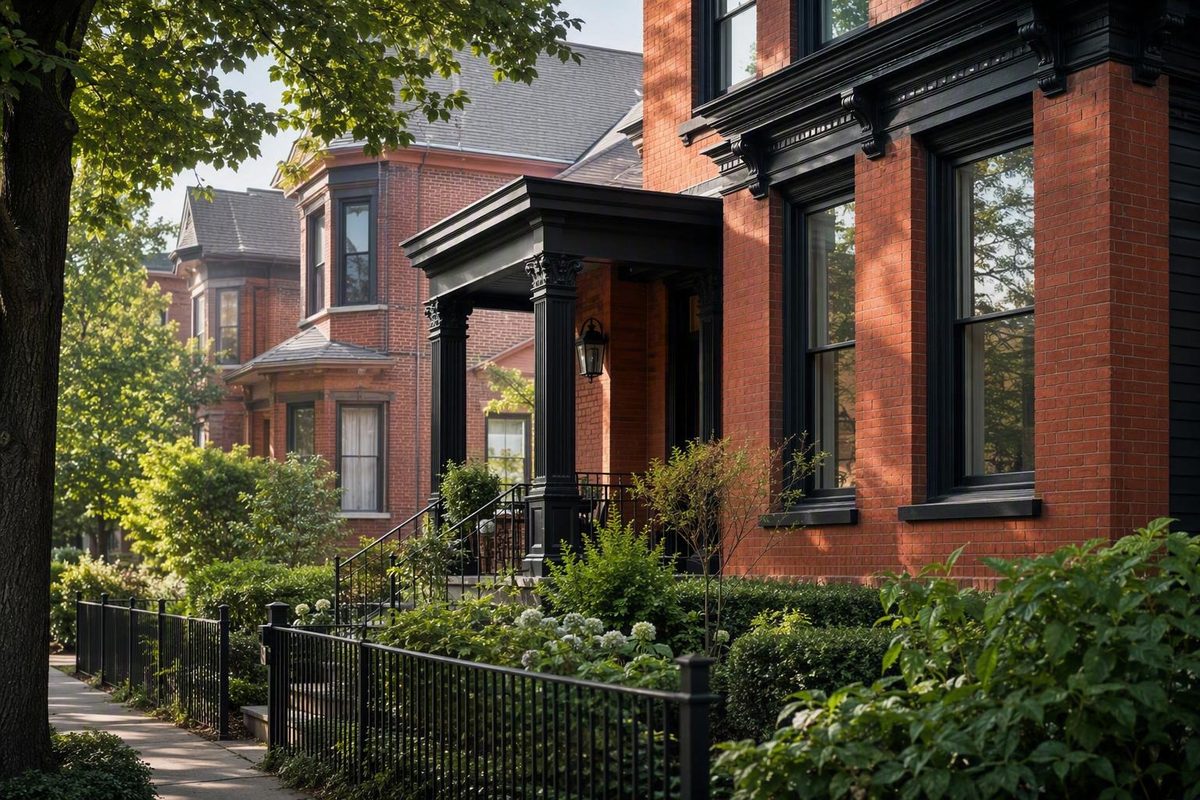
A red brick house with black trim can look coherent and distinctive, but black is not an automatic upgrade. The result depends on the brick’s undertone, mortar, roof, windows, architecture, facade proportions, landscaping, natural light, and—most importantly—where the dark color appears.
“Red brick” is not one predictable color. It may read orange-red, classic red, brown-red, cool burgundy, weathered, or pale. Individual bricks may also contain black, tan, cream, gray, or charcoal flecks. Mortar can be warm beige, pale gray, white, or brown. Every variation changes how black or near-black paint looks beside the masonry.
Contrast alone is therefore not a complete design strategy. Dark color also needs proportion, repetition, and a relationship to the house’s fixed materials. A black front door may feel isolated when it is the facade’s only dark object. The same door can feel intentional when its color reappears in shutters, railings, lamps, gutters, window grids, the roof, or dark tones within the brick.
Terms such as modern, traditional, harsh, and balanced describe visual reactions, not objective outcomes. The practical question is not whether black trim is universally right for red brick. It is whether a particular dark color, applied to particular elements, works with your house.
Does black trim work on a red brick house?
Yes—black trim can work with natural red brick. The answer is conditional because the same paint can create very different effects on different houses.
Brick color is the first variable. Strongly orange masonry can produce a sharper black-and-orange contrast than muted brown-red brick. Burgundy, weathered, pale, and highly varied brick create different relationships again. Mortar matters because its repeated joints form a visible grid: light mortar increases the contrast across the wall, while darker mortar may make the masonry read as a more unified field.
The roof and windows are equally important. A black or charcoal roof provides an existing dark element to repeat. A medium-brown roof may give you a reason to test dark bronze-colored paint or black-brown alongside neutral black. Dark window frames can support a broad dark scheme; fixed white units may interrupt one.
Architecture determines how much contrast the facade can organize. A house with a few large, clearly defined features may accommodate substantial dark areas. A busy elevation with small casings, brackets, vents, dormers, and divided windows can become fragmented if every edge is outlined.
Dark trim is most likely to appear intentional when it:
- Repeats on several meaningful features rather than appearing once.
- Relates to the roof, windows, metalwork, or darker tones in the brick.
- Reinforces the main architectural pattern.
- Leaves enough brick or supporting color to remain visually dominant.
- Avoids emphasizing every minor seam and accessory.
Professional color consultant Maria Killam similarly treats black as a conditional choice, emphasizing proportion and balance and recommending particular caution with strongly orange brick. Her suggested alternatives include selective black accents, lighter balancing areas, green-gray, and bronze-colored details rather than indiscriminate use of pure black (Killam’s analysis of black trim with brick).
Before choosing a paint, decide which overall effect you want:
- Full dark trim across most principal painted details.
- Selective dark trim on a limited group of architectural features.
- Light principal trim with black shutters, a black door, or other accents.
These are different exterior schemes, even though inspiration searches often group them together.
Audit the brick and fixed exterior colors first
Do not begin at the paint display. Begin with a whole-house inventory that separates fixed materials from surfaces that can reasonably be recolored.
Walk around the property and record:
- Brick field color: The overall color from a normal viewing distance.
- Secondary brick colors: Black, brown, gray, burgundy, cream, or tan flecks.
- Mortar: Its apparent warmth, value, and contrast with the brick.
- Roof: Black, charcoal, brown, weathered gray, or a mixed blend.
- Window units: Frame and sash color, material, and paintability.
- Existing siding: Color, texture, and proportion relative to the brick.
- Soffits and fascia: Whether they read as one band or separate features.
- Gutters and downspouts: Whether they blend with the roofline or cross the masonry.
- Garage doors: Often among the largest adjustable color fields.
- Shutters and exterior doors: Potential accent locations.
- Railings, lamps, and metalwork: Opportunities to repeat a dark family.
- Porch materials: Columns, flooring, steps, ceilings, and foundation surfaces.
- Landscaping and paving: Large areas that affect the facade’s overall setting.
Inspect brick and mortar together. Mortar occupies less area, but its repeated joints affect the apparent warmth and contrast of the entire wall. Warm beige mortar gives you a reason to sample cream, greige, black-brown, or bronze-colored paint. Pale gray mortar may make charcoal easier to connect to the masonry. These are testing directions, not guaranteed matches.
Next, describe the brick informally. Does it lean orange, earthy brown, clear red, cool burgundy, weathered, or pale? The purpose is not to force the masonry into a formula. It is to compare paint with what is physically present.
Use this decision hierarchy:
- Resolve the windows. Their color and paintability may rule out a continuous dark-window treatment.
- Resolve the roof. It is a large, visually dominant fixed surface.
- Compare brick and mortar together. Treat them as one varied material field.
- Assign colors to adjustable elements. These may include shutters, doors, fascia, gutters, railings, siding, and garage doors.
A brown roof may make black-brown or a dark bronze hue worth testing. A charcoal or black roof may make soft black or gray charcoal easier to repeat. Neither relationship is universal; roof weathering, undertone, visibility, and surrounding materials can change the result.
Trim related closely to the mortar can create a quieter, lower-contrast exterior. Darker trim can make windows, rooflines, and structural details more explicit. Neither approach is inherently better. Brick-industry color guidance likewise recommends considering mortar, roofing, windows, gutters, soffits, fascia, garage doors, and landscaping as parts of one exterior palette rather than choosing trim in isolation (US Brick’s brick-and-trim guidance).
Before moving on, label each exterior component:
| Component | Fixed | Paintable after confirmation | Easily adjustable |
|---|---|---|---|
| Brick and mortar | Usually | Separate technical decision | No |
| Roof | Usually | No | No |
| Window frame or sash | Often | Product-dependent | No |
| Window casing | Sometimes | Product-dependent | Sometimes |
| Fascia and soffits | Sometimes | Product-dependent | Often |
| Gutters and downspouts | Sometimes | Product-dependent | Sometimes |
| Shutters and doors | Sometimes | Product-dependent | Often |
| Railings, lamps, and hardware | Sometimes | Product-dependent | Often |
This simple map prevents an attractive concept from depending on recoloring a surface that should remain unchanged.
Choose between full black trim and selective black accents
The phrase “red brick house black trim” commonly describes three distinct looks.
Full dark trim
Black or near-black covers most principal painted details, potentially including fascia, soffits, window casings, doors, columns, gutters, siding panels, and garage doors.
This approach is most plausible when the house already has dark windows, a dark roof, large simple trim elements, or repeated dark panels. It can also work when the architecture provides a strong structural pattern.
Even then, cumulative visual weight matters. A facade may feel much darker when black covers the windows, fascia, gutters, soffits, garage doors, columns, and railings than any individual sample suggests.
Selective dark trim
Black is assigned to specific architectural elements while other trim remains light or mid-toned. This is often the lower-risk starting point when:
- The brick is strongly orange.
- The windows are fixed white.
- The facade contains many small decorative details.
- The roof is medium brown rather than charcoal or black.
- Existing light trim relates well to the mortar.
- There is no large fixed dark feature to anchor broad black trim.
- You are uncertain about a high-contrast scheme.
Useful selective locations include the front door, shutters, railings, lamps, fascia, gutters, porch beams, compatible window grids, brackets, and repeated hardware.
Light trim with black accents
White, cream, greige, or another light color remains the principal trim color. Black is limited to shutters, a door, lighting, railings, or hardware.
A red brick house with white window trim and black shutters is not an all-black-trim house. It is a light-trim scheme with black accents, and that distinction matters when comparing inspiration examples.
Match placement to the architecture
Architectural style can suggest where dark color belongs:
- Georgian-style facade: Black shutters, front door, railings, and lamps can form a repeated accent system while the principal trim remains light.
- Tudor Revival: Dark beams and selected trim can reinforce the architecture’s visible structural pattern.
- Modern mixed-material facade: Dark windows and repeated panels may establish enough visual structure to support broader dark areas.
These arrangements appear in a manufacturer’s style-specific overview of red brick and black trim, including Georgian, Tudor Revival, modern, and pale-brick examples. Its descriptions are useful as inspiration, not proof that a treatment will suit every house (Allura’s red-brick and black-trim examples).
Test placement by visual impact
Move from contained accents to broader applications:
- Front door: Tests whether the dark family relates to the brick without changing the entire facade.
- Shutters or railings: Shows whether repeated black creates a useful rhythm.
- Lamps and metalwork: Connects larger accents through smaller repeated details.
- Fascia or gutters: Introduces a continuous roofline band.
- Window surrounds: Requires a separate check against the window-unit color.
- Broad principal trim: Should be tested only after the smaller scheme feels coherent.
A quick placement comparison can help:
| Scheme | Door | Shutters or railings | Roofline | Window surrounds | Principal trim |
|---|---|---|---|---|---|
| Accent only | Dark | Optional | Light | Light | Light |
| Selective dark | Dark | Dark | Optional dark | Evaluate separately | Mostly light |
| Broad dark trim | Dark | Dark | Dark | Dark if compatible | Mostly dark |
Do not assume every element must match. Light window surrounds can coexist with dark shutters, fascia, railings, or doors when the separation is intentional and repeated.
Compare true black, soft black, charcoal, bronze, and black-brown
“Black” is a color category, not one exterior effect. A chip that appears neutral indoors may reveal gray, brown, blue, or violet tendencies outside. Compare dark families rather than treating all near-blacks as interchangeable.
True black
A relatively neutral, deep black creates the strongest edge against light mortar and warm brick. It may suit a facade with existing crisp black features, but it can appear severe beside strongly orange masonry or bright white windows.
Soft black
Soft black remains recognizably black but creates a less absolute contrast. It is worth testing when you want a definite dark accent without making every painted edge as hard as it would be in a deeper neutral black.
Charcoal
Charcoal has a more visible gray component. It may relate to a gray or weathered roof and reduce the visual jump between pale brick and very dark trim. Gray-leaning charcoal coordinated with the roof is one documented suggestion for pale red brick in Allura’s design examples.
Dark bronze
“Dark bronze” can refer to a bronze-colored paint, a factory-applied finish, or actual metal. Those surfaces will not necessarily look the same. At the palette stage, treat dark bronze as a warm, brown-related color direction unless you are specifying a particular product or metal finish.
Against orange-red or brown-red brick, this warmer direction may feel more connected than a cool black. It is especially worth sampling when the house already has brown roofing, bronze-colored lighting, or warm metalwork.
Black-brown
Black-brown can look nearly black from the street while showing its brown relationship at closer range. It is not automatically better for warm brick, but it is a useful alternative when neutral black appears detached from a brown roof or earthy masonry.
Blue-black
Blue-black or deep blue-charcoal is another distinct family. Its blue component may become more obvious outdoors, so it should be judged in direct relation to the roof, windows, brick, and changing light rather than chosen from an indoor chip.
For orange-red brick, compare pure black with at least two softer directions, such as charcoal, bronze, black-brown, or soft black. That does not mean orange brick always clashes with black. It means the contrast is pronounced enough to justify a direct comparison.
A homeowner with a medium-brown roof used exterior swatches and digital mock-ups to compare Sherwin-Williams Black Magic and Black Fox. In that personal account, Black Magic was viewed as the bolder soft black, while Black Fox appeared subtler and more connected to the roof. The post did not document the completed selection, so it illustrates a comparison process rather than a final recommendation (the Black Magic and Black Fox comparison).
Sourced candidates for an initial sample set include:
- Sherwin-Williams Tricorn Black
- Sherwin-Williams Iron Ore
- Sherwin-Williams Black Magic
- Sherwin-Williams Black Fox
- Sherwin-Williams Cyberspace
- Benjamin Moore Black Beauty
- Benjamin Moore Cheating Heart
- Benjamin Moore Onyx
These are candidates mentioned in the supplied design and homeowner sources, not guaranteed matches. Product names and formulations should be confirmed with the current manufacturer information before purchase.
A practical shortlist is:
- One true or soft black
- One gray charcoal
- One warm black-brown, bronze-colored dark, or restrained blue-black
Color Concierge identifies Iron Ore, Black Beauty, Cyberspace, and Cheating Heart as dark candidates for red brick and notes that deep colors can reveal more of their undertones outside. Its examples also show why a color name or online photograph cannot settle the decision (Color Concierge’s dark-color examples).
Resolve the window color before painting the surrounds
A window unit and the trim around it are separate components:
- The window unit includes the frame, sash, and operable panels.
- The surround or casing is adjacent architectural trim.
- Shutters, lintels, sills, headers, and grids are additional elements.
This distinction creates a critical go/no-go checkpoint.
When the frames or sashes are already dark—or are legitimately paintable under product-specific guidance—dark surrounds can form a continuous composition. The eye reads one dark window assembly rather than a light unit inside a contrasting border.
Fixed white windows are more difficult. A black surround around a bright white frame creates several layers: dark casing, white unit, and dark interior glass. On some facades that graphic effect may be acceptable. On others it can make the windows look boxed in or disconnected from the brick.
Alternatives include:
- Retaining warm white or cream immediately around the windows.
- Using dark color on fascia, gutters, siding, or roofline details instead.
- Limiting black to shutters, the door, railings, lamps, and metalwork.
- Choosing a mid-tone surround related to the mortar.
- Keeping white surrounds while repeating dark accents elsewhere.
One documented Iron Ore project retained warm light trim around white vinyl windows rather than forcing a fully dark window assembly. The same professional color-consulting source recommends coordinating white windows with white or warm-white trim and reserving broader dark treatments for compatible dark windows (dark paint with white and dark window configurations).
A Houzz discussion illustrates the concern without establishing a universal rule. Most participants disliked the black border around the photographed white units, especially beside orange-toned brick, although one participant found it acceptable. Suggested alternatives included white, dark brown, and charcoal; one commenter preferred black at the roofline but not around the windows (the red-brick window-trim discussion). These reactions concerned one house and a limited photograph.
Before approving the palette, confirm the window material, paintability, preparation requirements, and warranty implications with the manufacturer or an appropriate professional. Do not assume vinyl, aluminum, fiberglass, composite, wood, and factory-finished components can receive the same coating.
Make the checkpoint explicit:
- Go: The dark surround creates a cohesive assembly with the existing window.
- Revise: The white unit looks boxed in, but a lighter casing integrates it.
- Stop: The unit should not be recolored, and every tested dark surround remains disconnected.
Resolving this early prevents otherwise successful roofline, shutter, and door colors from being undermined by the windows.
Build a balanced whole-house palette
Black should be selected as part of a complete palette, not as an isolated trim color. Even when the brick remains unpainted, the facade usually has three broad color roles:
- Dominant field: Usually the brick.
- Supporting color: Siding, soffits, window surrounds, columns, porch ceilings, or garage doors.
- Accent color: Door, shutters, railings, lamps, or selected roofline details.
Warm white, cream, greige, warm gray, sage, and muted green-gray are useful supporting families. They can create separation between heavy dark accents and warm masonry without introducing the sharper effect of very bright white.
For strongly orange brick, Killam’s professional design opinion favors a meaningful amount of green-gray on elements such as soffits, fascia, or stairs to soften the black-and-orange contrast. She also suggests bronze as a less severe alternative to pure black. These are directions to sample, not rules.
A supporting light or mid-tone might remain on:
- Window surrounds
- Soffits
- Porch ceilings
- Columns
- Garage doors
- Siding
- Foundation surfaces
- Decorative panels
Black or near-black can then be reserved for:
- Shutters
- Front door
- Railings
- Lamps
- Gutters or fascia
- Compatible window grids
- Repeated hardware
The optional 60/30/10 concept assigns the brick to the dominant role, secondary painted surfaces to the supporting role, and doors or shutters to the accent role. It is a planning aid, not a requirement to calculate exact facade percentages (US Brick’s explanation of the 60/30/10 approach).
Try to repeat the dark family in at least one fixed or recurring feature. The connection may be obvious, such as charcoal fascia beneath a charcoal roof, or subtle, such as a black-brown door that echoes dark brown flecks in the brick.
Palette direction 1: Orange-red brick
- Dark family: Black-brown or dark bronze-colored paint
- Supporting family: Cream or muted green-gray
- Dark placement: Door, shutters, railing, and selected roofline details
- Keep lighter: Window surrounds and possibly soffits, especially with fixed white windows
This direction is intended to soften the severity of a pure-black-and-orange pairing without eliminating dark contrast.
Palette direction 2: Classic red brick
- Dark family: Soft black
- Supporting family: Warm white or greige
- Dark placement: Door, shutters, fascia, lamps, and railings
- Optional expansion: Window surrounds only when the units support a continuous dark assembly
This creates a clear dark accent while retaining a visual bridge between brick and black.
Palette direction 3: Pale red brick
- Dark family: Gray-leaning charcoal
- Supporting relationship: A visible gray or charcoal roof
- Additional accent: Restrained terracotta-colored details
- Dark placement: Selected trim bands and compatible window or architectural elements
The charcoal-and-roof relationship and restrained terracotta details are documented design suggestions for pale red brick, not guaranteed combinations (Allura’s pale-brick example).
Treat all three recipes as bounded sample directions. Roof color, mortar, exposure, window configuration, and architectural style can change the result.
Test color and placement on the actual house
Exterior testing must answer two separate questions:
- Which dark family coordinates with the fixed materials?
- How much of that color should appear on the facade?
Use a disciplined workflow rather than relying on one chip or digital image.
1. Shortlist distinct color families
Select one black and two near-black alternatives. For example:
- Soft black
- Gray charcoal
- Black-brown or bronze-colored dark
If the roof is cool gray or slate-colored, you might test a restrained blue-black instead of the warmer option. The goal is to compare meaningful directions, not many nearly identical chips.
2. Place samples beside brick and mortar
Do not assess a sample against brick alone. Position it where you can see the brick faces, mortar joints, and the surface that may actually be painted.
Use samples large enough to assess from the street as well as close up. A small chip cannot show how a continuous dark band will affect the facade.
3. Compare samples with the roof and windows
Stand far enough back to include the roof. Then move closer to inspect the windows.
A dark color may work with the masonry but still reveal an unwanted undertone beside the roof. It may also create an awkward outline around a white window unit. Record those as separate observations.
4. Test more than one elevation
Place the shortlisted colors on more than one side of the house when practical. A bright elevation and a shaded elevation may produce noticeably different readings.
The objective is not to make every side look identical. It is to identify a color that remains connected to the fixed materials as conditions change.
5. Review changing light
Inspect samples in:
- Morning light
- Midday light
- Open shade
- Overcast weather
- Dusk
Renoworks advises evaluating exterior colors beside the brick, trim, and roof in both sun and shade because natural light changes their appearance (exterior color-testing guidance). Treat any unexpected blue, gray, brown, or violet reading as an observation to verify repeatedly, not as a conclusion drawn from one moment.
6. Test placement as well as color
Create four versions of the scheme:
- Door only
- Door plus shutters or railings
- Accents plus roofline
- Broader principal trim
Evaluate window surrounds separately. They do not have to match the fascia, gutters, door, or shutters.
For a consistent comparison, use a simple facade map:
| Version | Door | Repeated accents | Roofline | Windows | Broad trim |
|---|---|---|---|---|---|
| A | Dark | Light | Light | Light | Light |
| B | Dark | Dark | Light | Light | Light |
| C | Dark | Dark | Dark | Light | Light |
| D | Dark | Dark | Dark | Dark if compatible | Dark |
Changing one category at a time makes it easier to identify which placement improves or weakens the composition.
7. Use digital mock-ups for proportion
Digital mock-ups can help you judge:
- Whether black overwhelms the brick.
- Whether dark elements repeat clearly.
- Whether the roofline looks too heavy.
- Whether window outlines fragment the facade.
- Whether the garage door becomes too prominent.
- Whether accents are balanced across an asymmetrical elevation.
Use the same photograph, crop, and camera angle for every version. A mock-up is not a color guarantee: photography, editing, screen settings, glare, shadows, and simulated paint can distort the result. Use digital images to assess placement and proportion, then return to physical samples to select color.
8. Keep an observation record
Photograph each sample from the same position and record:
- Paint name or sample code
- Date and time
- Weather
- Wall orientation
- Sun or shade
- Adjacent brick and mortar
- Visible roof and window colors
- Observed undertone
- Reaction from close range
- Reaction from the street
The record helps distinguish a recurring problem from one unrepresentative photograph. Choose the option that remains coherent with the brick, mortar, roof, and windows across several conditions—not simply the one that looks best in one image.
Make the final decision without painting the brick
Repainting surrounding details while retaining natural brick is materially different from coating the masonry. It lets you change the facade’s contrast and emphasis without replacing the brick’s natural variation with a uniform painted field.
Possible updates include:
- Black shutters
- A dark front door
- Railings and metalwork
- Exterior lamps
- Gutters and fascia
- Compatible window grids
- Selected beams
- Dark siding panels
- Repeated garage-door hardware
A Cape Cod homeowner documented a clear light-trim alternative: the red brick was retained, Benjamin Moore Simply White was used for the principal trim, and Benjamin Moore Onyx was applied to the shutters and front door. Landscaping also changed during the project, so the photographs do not isolate paint as the sole reason for the overall difference (the white-trim and Onyx-accent makeover).
Painting the brick is a separate technical project involving the existing masonry, its condition, preparation, coating selection, maintenance, and future alteration. Those questions require assembly- and product-specific guidance from an appropriate masonry or coating professional. Painting the masonry is not necessary to create a red brick house with dark trim.
Use this checklist before approving the work:
- [ ] Identify the brick’s dominant color direction.
- [ ] Note secondary flecks and the mortar color.
- [ ] Document the roof, windows, and other fixed materials.
- [ ] Confirm which surfaces can appropriately be painted.
- [ ] Resolve white or nonpaintable windows.
- [ ] Choose the intended contrast level.
- [ ] Decide between full dark trim, selective dark trim, and light trim with black accents.
- [ ] Assign the dark color to named elements.
- [ ] Select a supporting light or mid-tone family.
- [ ] Test physical samples on multiple elevations.
- [ ] Compare placement through consistent mock-ups.
- [ ] Review the complete facade from the street.
- [ ] Recheck samples in different weather and light.
Apply a stop condition when necessary. If black window surrounds remain disconnected from fixed white units, keep the window trim light and redirect the dark color to shutters, doors, railings, lamps, gutters, or fascia. If every tested neutral black makes orange-red masonry appear more intense than you want, test bronze-colored darks, black-brown, charcoal, or fewer dark accents.
Before painting windows, factory-finished components, metal, vinyl, composite materials, or any unfamiliar substrate, obtain product- and material-specific guidance. General color strategy cannot substitute for coating instructions.
A successful dark-trim scheme begins with the house rather than a paint name. Resolve the windows and roof, read brick and mortar together, decide how much contrast the architecture can support, and compare true black with softer alternatives outdoors. When broad black trim looks severe or disconnected, light window trim and a few repeated dark anchors can preserve the contrast without overwhelming the natural masonry.
What black paint colors are commonly considered with red brick?
Sourced candidates include Sherwin-Williams Tricorn Black, Iron Ore, Black Magic, Black Fox, and Cyberspace, plus Benjamin Moore Black Beauty, Cheating Heart, and Onyx.
None is universally best. Confirm current product information, then test one true or soft black and two distinct near-black alternatives beside the brick, mortar, roof, and windows.
Will black trim look too harsh with orange-red brick?
It can, especially when deep neutral black is applied broadly or used to outline fixed white windows. Orange-red brick does not always conflict with black, but the strong contrast deserves careful testing.
Compare pure black with soft black, charcoal, a bronze-colored dark, and black-brown. You can also keep cream, warm white, or muted green-gray on window surrounds, soffits, or siding while limiting black to the door, shutters, railings, lamps, or roofline.
Should the soffits, fascia, gutters, shutters, and door all be black?
Not necessarily. Applying the same dark color to every component can make a detailed facade feel heavy or fragmented.
Start with the door and repeated accents, then test the roofline. Keep soffits or window surrounds light when they provide useful separation. Gutters may relate to the fascia, roof, or wall depending on whether you want to emphasize or minimize them.
Can I use black trim around white vinyl windows?
You can evaluate a black surround, but a dark casing around a bright white unit may create an outlined or disconnected appearance. Treat the window unit and surrounding casing as separate components.
A lower-risk option is warm-white trim immediately around the window with black on shutters, the door, fascia, gutters, railings, lamps, or siding. Do not assume the vinyl or factory finish can be painted; confirm material, preparation, coating, and warranty requirements with the manufacturer or an appropriate professional.
How should I test a dark exterior trim color?
Shortlist one black and two near-black alternatives. Place large physical samples beside both brick and mortar, compare them with the roof and windows, and review them on more than one elevation under changing light.
Then create consistent mock-ups showing door-only, repeated-accent, roofline, and broader-trim versions. Use mock-ups to judge placement and proportion, not exact color. Choose the scheme that remains connected to the masonry and fixed materials across several conditions.